Behind The Scenes: Oddhop Puzzles
It's been well over a year since our "glorious" Oddhop launch that — in the grand scheme of things — basically amounted to about two and half farts in the wind.. 😛 So, to celebrate our triumph I decided to let you guys and gals on a little secret: all of the puzzles in Oddhop are procedurally generated. 😎 That's right. We did hand-pick the puzzles, but we didn't come up with them in "traditional means" (whatever those may be for your average puzzle game): instead we created a tool for the puzzle generation.
Without further ado, let's get behind the scenes. This post is not going to be overly technical, but also hopefully not too trivial either. Let me know if it turned out to be worth reading. Oh, be sure to click on the pictures to actually see what's going on.
* * *
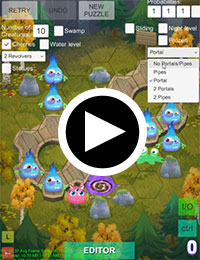
Game designer Teemu came up with the basic procedure of generating these "jump over piece to eliminate" puzzles, and that was the starting point for 1st prototype I did. It's interesting to note that the algorithm works backwards: it starts from the final, solved state of the puzzle and traces backwards from there. Essentially it starts with one piece on the board (the last remaining piece from players point of view), jumps it to a chosen direction, and spawns another piece to be eaten when playing the puzzle. Then a random piece is picked, and it is again moved and a new piece gets added. And so on.
While all that sounds very simple on paper, and was simple at the beginning of the prototype, it actually turned out not to be the case! Instead I got the fun but difficult programming challenge to make a generator that could create proper levels based on various features and parameters. So for each gameplay feature there was quite a bit of head-scratching in how I could fit that into the generator, creating levels that are actually solvable, and in way that didn't break the existing gameplay features already in! No point generating puzzles that cannot be solved, right? 🙂 Essentially each gameplay mechanic needed to be implemented twice: way to reliably generate them (difficult!) and way for the player to perform them in game (much easier!). If you ever were wondering why creating the game took over 2 years, I can tell you the puzzle generator was a big part of it.
Basically each level had a random seed and set of parameters (including version) that were used as an input to the generator. I added a textbox to the UI where the input was shown as a comma separated text string (V17,1193020924,10,1,1,1,0,0,1,0,1,0,0,0,1,0,1,0,0,0,0,0,2), so we could easily copy/paste levels and share them by email, in text form. (Actual level serialization was implemented late in the development cycle, not to mention sharing binary files wouldn't have been as quick and easy as sharing pieces of text.) So for example I would play with the generator, and when it yielded a nice level I'd take the input string and shared it with Teemu ("hey check out this cool level!") and vice versa. We often challenged each other to solve the puzzle, to see who did it with fewer tries. Teemu assembled the final level packs, and I contributed some levels (meaning I just randomly found nice puzzles! 😉). As you can see in the GIF above, gameplay is fully integrated into the generator, so levels can be immediately tested while searching for that "one nice puzzle".
Like I mentioned, levels also had a version, which meant that the generator needed to backwards support several versions of levels. We kept iterating on the mechanics and tweaking the generation heuristics (more on those below) and obviously that often required lots of changes in the generator, and I tried to keep it all working, including the old level inputs we had gathered. In hindsight that was unnecessary complexity, as I don't think we used any of the old levels in the final game. 😐 Periodically I cleaned the code and took out support for very old, obsolete versions. I had a growing version specifier, and it got up to V17 meaning 17 iterations on the input format (actual generator changed much more, of course). When I finally implemented level pack serialization and we saved the levels, I could happily get rid of the remaining backwards compatibility from the code. And there was much rejoicing.
As the programmers among us can imagine, the generator code got very complex in the end and touching it for feature tweaks or anything was scary to say the least. Not to mention debugging the puzzle generation when a gameplay feature was yielding invalid (unsolvable) puzzles! 😵 I made a debug output that printed out each step (the level layout, that is) of the generation in textual format to the Unity console, so I could pinpoint the step where it went wrong and fix it. And for some puzzles I generated I couldn't solve them in reasonable time, assumed the generator was broken and examined the debug output only to find out it was actually solvable and I was just too stupid! 😄 I also gave some puzzles to my wife when I couldn't solve them, and either she solved it or I stumbled upon the solution watching her try. Or we gave up and checked the debug output.. Good times!
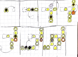
Some gameplay features were quite tricky compared to others: for example the sliding flowers / ice patches (they were actually oil stains initially!) and the portals/wells gave me some trouble to implement correctly. We also had to scrap some gameplay mechanics because they were deemed too difficult to implement into the generation, or were painstakingly implemented but were not fun or necessary. That was always painful! 😄 On the right you can see some pen & paper design I did for the lily pads generation; originally they were meant to always slide to the jump direction (like the flowers ended up doing). While that particular instance in the pic worked, I couldn't get the generation work reliably so we went with simpler implementation, although the sliding flowers did add some of that back.
Bonuses (the cherries) were randomly placed on cells that were visited by any creature during the generation, so that they could be actually collected. Likewise, obstacles (rocks) were placed on cells that had no visits. All the creatures start as normal blue monsters, and get "promoted" during the generation to their special roles. When searching for direction for a creature to move, the generator first checks if there are "half-baked" green two-headed blobs around, and prefers those. This is so that the green dudes actually get two jumps over, otherwise they could just as well be normal blues. Frozen creatures are internally realized as green slimes with secondary (player visible) type assigned, they spawn out "half-eaten" and when jumped over second time get frozen in place.
Some gameplay mechanics were incompatible with each other — or maybe you set some ridiculous parameters, amount of creatures etc. — so the generator tried to brute force a valid level out, but if it couldn't in 512 tries it stopped and displayed a warning that the level is likely invalid. And actually the generator always tried to generate 10 potential levels and pick the best one from the those. (The warning was displayed when it couldn't generate even one potential level.) To decide if any given level was a potential level, we had lots of heuristics in place to discard bad or boring levels. For example, if a creature that was frozen didn't get to move at all before being eaten (after being freed from the ice), the generator discarded the level and tried again. Or maybe we had revolving platforms but nobody ended up standing on them at puzzle start? Or a dude went through portal only to do nothing? That's boring, so the generator discarded these. For each potential level the generator took up to 512 tries to find a level candidate.
With the 10 potential levels, the generator picked the one with the most variance in creature starting positions, meaning the one that likely had most movement across the map. After all it'd be boring to have creatures moving in one corner for the whole level, right? I remember we were discussing that maybe we had too many heuristics in place, as the levels could get quite "uniform" in a way, and I added "less heuristics"-toggle to the editor. 😄 Can't remember if that was actually used at all, though. At least it doesn't appear the UI any more.. Maybe the heuristics were relaxed, or something.
* * *
Remember I said that all of the puzzles were procedurally generated? I kinda lied, but only a bit: for a couple of the tutorial (intro) levels we did edit the generated puzzles. Ironically the need to edit levels in the end of the development cycle meant I had to make an editor that allowed moving/changing the creatures, cherries and obstacles. The editor was used to tweak the tutorial levels and also to do some visual adjustments to the random obstacle generation for many non-tutorial levels. The actual gameplay content in Oddhop is still exclusively work done by the puzzle generator, we just picked out the best bits. 🙂 After over two years of service, the level generation code was unceremoniously stripped out of the release builds, as it wasn't needed at runtime because the level packs were serialized into binary format.
Additionally, if you're wondering why to bother with the fancy generator at all: two reasons. First, it seemed like a neat idea to program a thingy to generate the puzzles (naturally that turned out to be a huge pain point during the project due to its eventual complexity! 😛). And second: I had plans to actually make a more polished UI for it and include it in the game build for the players to use. So they could create endless levels to play, and perhaps share good puzzles with other players. Perhaps even Puzzle of the week -type of things etc. Unfortunately the game didn't catch on so there was no point in doing that, and also no reason to implement the new gameplay mechanics we had designed, but not yet bolted on to the generator.. 🙁
Anyway, I hope this has been half interesting read. Have a good day, and do comment if you want to ask on the subject or enjoyed the post! 🙂
Oddhop Holiday Gift!

Hey, long time no see! We have some news for you: to celebrate the holidays Oddhop is now FREE for a limited time on the App Store! That means now is the perfect opportunity to "hop" in and try the game! Do spread the word out if you enjoy Oddhop and maybe even consider giving us a rating / review on the App Store. Cheers! 🙂
So, happy holidays from us! We'd also like to thank our early players who had purchased Oddhop since the launch in May, and hope we can get more people on board with this special occasion. See you next year!
Today is the day: Oddhop out NOW!

See what I just did there with the post title? I avoided starting the title with the word Oddhop! Had to break that particular pattern. 😉 Anyway, this is just a quick announcement that the game is indeed out right now, so you should go and download it!
It's free on the Google Play Store (ad-supported, but don't worry — you can purchase the ads away) and $1.99/1,99€ on the App Store. BUT, if you act quick, you can get it on our celebratory launch sale for 50% off, so it's just $0.99! The launch sale ends in a week (May 20th to be exact), so now is definitely the best time to "hop" (pun intended) on board! 😄
Personally this has been — once again — quite a journey, with a small-turned-out-to-be-not-small-at-all project so I am very glad to have the game out, finally. Hopefully the launch goes without fatal issues (wish us luck!). Also happy that I managed to ship a game while hooked on Dark Souls III! 🙂 Anyway, that is it for now. Enjoy the game, maybe even give us a rating on the stores and feel free to comment or even write a review!
Oddhop launches on May 12th!
Good news, everyone! I'm proud to announce that the puzzle game we've been working on for the past 2+ years is finally releasing! And quite soon, too: the Oddhop launch date is May 12th! 🙂
We're launching on the App Store and the Google Play Store simultaneously. The game will be $1.99/1,99€ on iOS, and free (with ads) on Android. However, to celebrate the launch we will be putting the game on sale right off the bat! So for the first week after launch (up until May 20th) Oddhop is 50% off! No reason not to grab it, right? 😄
Finally: here is the launch / gameplay trailer. Take it for a spin if you've got a spare minute, and do give the video a thumbs up if you enjoyed it and/or are looking forward to playing the game! Comments are also most welcome, as always. Thanks for the interest and enjoy the trailer! 🙂
Oddhop Visual History
When starting work on the original prototype that eventually became Oddhop, I thought it would be fun to collect some images along the way. And this is what I did — so here is a post showcasing various images from the old, ugly prototype to the now nearly finished (at least visually) game. 🙂 Personally it is motivating to look upon these images, as the game looked like shit not too long ago, so some progress has definitely been made!
So let's take a look! You can click on the pictures for a bigger view. 🙂
Early prototype (the "Looks like shit!" period)
You know that period of time where you are afraid to show your prototype to anyone, because it looks so bad it might actually physically hurt some people? Yeah, this is that period. 😛 On the left above is a screenshot taken on 17th of February, 2014. It's from the very first prototype, back when we had square levels! Those creatures would all rotate around in unison, for no reason other than it looked funny. 😄 On the right is how the game looked with hexagonal levels (March 2014). I quickly realised I wanted to use hexagons, both for visual appeal and also for more varied gameplay (more movement directions). I had my first animated (test) creature made at that point.
More prototyping (a.k.a "Polishing the turd" period)
(Not that I'd show these to anyone, either. Except now I guess I did.) Here on the left we have a radial hexagonal level (November 2014). Switch from rectangular hex levels to radial was made purely out of aesthetic reasons. It just looks much better. 🙂 Here you can also see the first iteration of the creature that ended up being blue in the final game.
On the middle is an early 3D background test (February 2015). Initially I had the idea to use lightmapped 3D scenery as the background. It would have allowed some nice things like different light maps for different times of day (it was simple to swap lightmaps in Unity 4.x, Enlighten[yuck!] in 5.x made that not-so-simple to pull off), and also opened up the possibility to use some premade assets (rocks, trees, etc.) without having to model everything myself. Those cliffs pictured are my own (quick test) models, though.
I played around with the 3D backgrounds for a while, including 2D trees on top of the scenery. It wasn't really working so I ditched the 3D stuff and went for image backgrounds. In retrospect it was a good decision even though it meant much more work! 🙂 So, on the right there is an early version of the swamp background theme (June 2015).
Starting to look like something.. (Other than shit.)
On the left is some lighting color studies I made, when searching for a pleasant color scheme for the swamp (June 2015). (As a side note: I really want to work on a PC game in the future and use proper, dynamic color grading!) Note the flowers on the background, we took those out soon after this. In the middle image (July 2015) the lighting is starting to look like it's now. At this point there were still no other backgrounds done, only the swamp! 😛 I made the backgrounds in decreasing order of complexity: swamp first (it needed render textures and shaders for the water animation), then the lake (water shader), snow (snow flake particles) and finally the forest (nothing special). That also was a quite good decision, if I may say so myself. 🙂
As for the lake theme: for some time I was just using the swamp trees on a green background with a blue diamond slapped in the middle as a placeholder, it looked quite horrendous (as you can imagine) and Teemu (the game designer) hated it, so I finally started working on the proper lake. On the right is an early lake screenshot, shortly after that disgusting blue square. (August 2015).
..but still not quite there, yet..
Here's more progress on the lake theme (August 2015). In the middle there is a first 3D test of the new "revolving platform" gameplay mechanic, originally it was a 2D gear sprite (October 2015). And finally there is a random night-time shot, showing the old placeholder portal graphics (November 2015). It is the forest theme, but as you might notice I only have a placeholder background texture there and the trees are from the swamp! 🙂
And finally, here is a shot showing the work-in-progress version of our "portal" wells (December 2015)! That's it for now, I have some WIP UI stuff but that's not very interesting (I would think), so I guess this shall do the job. 🙂 Let me know in the comments (or hit me up on Twitter) if you liked/hated this post!


 Follow @mhgames.org
 Follow @mhgames_
