Oddhop Visual History
When starting work on the original prototype that eventually became Oddhop, I thought it would be fun to collect some images along the way. And this is what I did — so here is a post showcasing various images from the old, ugly prototype to the now nearly finished (at least visually) game. 🙂 Personally it is motivating to look upon these images, as the game looked like shit not too long ago, so some progress has definitely been made!
So let's take a look! You can click on the pictures for a bigger view. 🙂
Early prototype (the "Looks like shit!" period)
You know that period of time where you are afraid to show your prototype to anyone, because it looks so bad it might actually physically hurt some people? Yeah, this is that period. 😛 On the left above is a screenshot taken on 17th of February, 2014. It's from the very first prototype, back when we had square levels! Those creatures would all rotate around in unison, for no reason other than it looked funny. 😄 On the right is how the game looked with hexagonal levels (March 2014). I quickly realised I wanted to use hexagons, both for visual appeal and also for more varied gameplay (more movement directions). I had my first animated (test) creature made at that point.
More prototyping (a.k.a "Polishing the turd" period)
(Not that I'd show these to anyone, either. Except now I guess I did.) Here on the left we have a radial hexagonal level (November 2014). Switch from rectangular hex levels to radial was made purely out of aesthetic reasons. It just looks much better. 🙂 Here you can also see the first iteration of the creature that ended up being blue in the final game.
On the middle is an early 3D background test (February 2015). Initially I had the idea to use lightmapped 3D scenery as the background. It would have allowed some nice things like different light maps for different times of day (it was simple to swap lightmaps in Unity 4.x, Enlighten[yuck!] in 5.x made that not-so-simple to pull off), and also opened up the possibility to use some premade assets (rocks, trees, etc.) without having to model everything myself. Those cliffs pictured are my own (quick test) models, though.
I played around with the 3D backgrounds for a while, including 2D trees on top of the scenery. It wasn't really working so I ditched the 3D stuff and went for image backgrounds. In retrospect it was a good decision even though it meant much more work! 🙂 So, on the right there is an early version of the swamp background theme (June 2015).
Starting to look like something.. (Other than shit.)
On the left is some lighting color studies I made, when searching for a pleasant color scheme for the swamp (June 2015). (As a side note: I really want to work on a PC game in the future and use proper, dynamic color grading!) Note the flowers on the background, we took those out soon after this. In the middle image (July 2015) the lighting is starting to look like it's now. At this point there were still no other backgrounds done, only the swamp! 😛 I made the backgrounds in decreasing order of complexity: swamp first (it needed render textures and shaders for the water animation), then the lake (water shader), snow (snow flake particles) and finally the forest (nothing special). That also was a quite good decision, if I may say so myself. 🙂
As for the lake theme: for some time I was just using the swamp trees on a green background with a blue diamond slapped in the middle as a placeholder, it looked quite horrendous (as you can imagine) and Teemu (the game designer) hated it, so I finally started working on the proper lake. On the right is an early lake screenshot, shortly after that disgusting blue square. (August 2015).
..but still not quite there, yet..
Here's more progress on the lake theme (August 2015). In the middle there is a first 3D test of the new "revolving platform" gameplay mechanic, originally it was a 2D gear sprite (October 2015). And finally there is a random night-time shot, showing the old placeholder portal graphics (November 2015). It is the forest theme, but as you might notice I only have a placeholder background texture there and the trees are from the swamp! 🙂
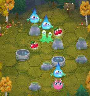
And finally, here is a shot showing the work-in-progress version of our "portal" wells (December 2015)! That's it for now, I have some WIP UI stuff but that's not very interesting (I would think), so I guess this shall do the job. 🙂 Let me know in the comments (or hit me up on Twitter) if you liked/hated this post!


 Follow @mhgames.org
 Follow @mhgames_
